
Considering that untrained first responders may do more harm than good to the patients, it is imperative to train users to perform first aid in cases of emergencies.
Design a responsive website and app for users to familiarize themselves with first aid techniques and safety tips. Different experiences are provided for different use cases (desktop v.s. mobile).
First aid tutorials are often in the format of text guides or video instructions. Both of which have their flaws in terms of user experience. In terms of text guides, it may be difficult for the user to scan through the text with much efficiency. On the other hand, the user may need to pause, rewind, and skip several times for clear instructions.
We considered our user's use cases when designing our application. As a result, we feature a flashcard and video format. The video and flashcard contents will be synchronized and users can choose to play it automatically or manually. By pressing next to continue to the next step, the users can have a firm grasp of the steps to perform the first aid.
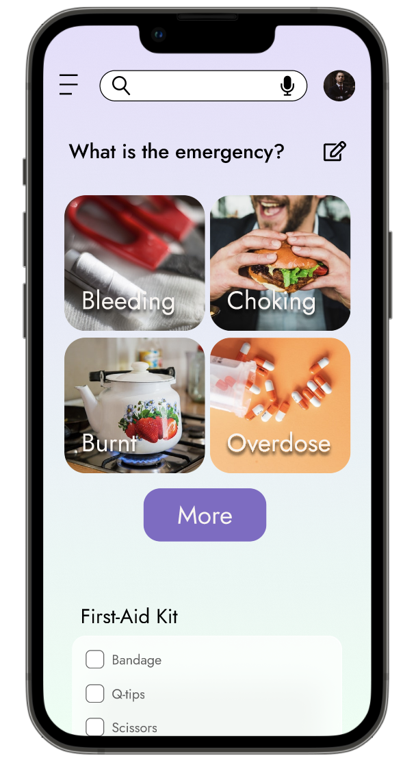
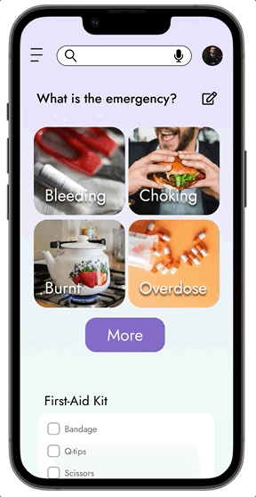
Considering the users of the mobile app would most likely be in an urgent situation, we designed the main menu to comprise big and bold buttons. In this case, the users can easily navigate between the "tutorial" and the "reading" part of the contents.

Jamie is a college freshman who needs to learn how to perform first aid in cases of emergencies because he wishes to be helpful to his friends.

Jackie is a stay-at-home mom with 2 kids who needs a streamlined means to check and teach first aid knowledge to her kids because she wishes that her children will be prepared for life

Jamie’s problem statement and user journey map showed there was a need for an app that let users search and follow through the tutorials to perform first aid.
We design the mobile experience to provide on-the-go first aid teaching tutorials and video guides.

Contrary to the previous case, Jackie’s problem statement and user journey map showed there was a need for a more cohesive website experience for desktop users.
We design the use case for desktop users to focus on the idea of "learning together with family members.”
For the RWD project for the desktop use cases, we have redesigned the IA to incorporate “shopping cart and management functions” for the “first-aid kit.”

The main idea is that users can order supplies while learning from desktops. On the other hand, app users are most likely in cases of emergencies. Therefore, these features are exclusive to desktop users.
As the goal is to provide streamlined and quick access to different tips and guides, we ideated and designed the wireframes considering user accessibility.
We used a flashcard-styled design to avoid the screens being cluttered with texts and buttons.

We used the crazy eight method to come up with eight basic layout designs for various pages of the desktop experience.
In the end, we decided to incorporate the “modular design” to make the experience consistent with that of the mobile counterpart.

As the use case for the app version is for emergencies, we focused on accessibility and ease of use. We designed the buttons to be large and easy to press. We also arranged the CTA buttons at the bottom of the screen.
We hope it’s easy to use with one hand.

The main user flow is to check for text and video tutorials on first-aid procedures.
We paid extra attention to design the layout so that it is operable with only one hand (such as the placement of CTA buttons).

We conducted two rounds of usability study for the app. First round is conducted to test the lo-fi prototype, while the second round is conducted to test the mockups.

We identified the following findings in the usability testing for the Lo-fi prototype.
The goal is to design an interface that is intuitive and quick to use.
However, after the usability studies, we found there is a need to introduce the users to the procedure. As a result, we added an intro page to each procedure to elaborate on the details.

We identified the following findings in the usability testing for the Mockups.
We redesigned the menu page to incorporate:
The main layout remained the same for ease of operation.


Before the usability study for mockups, we designed the landing page to be the menu.
After the study, we designed an intro sequence in which users can customize the contents shown on the homepage.


With newly-added intro pages, we can customize the contents shown on the homepage based on each user’s needs. We also added an “edit” button for the users to customize the homepage manually.


The Call-To-Action button located at the bottom of the screen enables easy access to the next page.
We have cleaned up the layouts and incorporated a “voice-over” button (marked w/ red arrow) that reads the text contents.


Thanks to the usability study for mockups, we realized there is a need to customize the homepage. As such, we added several intro pages to help the app familiarize itself with the user’s needs.


To accommodate for varying real estate of various devices, we redesigned the interfaces for mobile and desktop devices. Specifically, we redesigned the menu and the top navbar. We have also added a footer for a more traditional means of navigation.
We focused on the use case of "learning together and detailed explanation" for the desktop experience. We also took advantage of the larger real estate to incorporate a separate tab window for users to manage their first aid kit (my kit). Users can view what they are lacking and make purchases of respective items.


Our goal is to let people get educated and become comfortable with performing first aid.
We hope that with this app/website, the users can practice various first-aid techniques.
The users can also get an abundance of readings on safety tips.
As the use cases for mobile and desktop users are different, they are essentially two individual products.
It is therefore important to design each experience with the difference in user needs in mind.


