
About 125,000 people die annually because they took their medications incorrectly, and the problem costs the healthcare system more than $100 billion a year. Further, about 50% of patients do not take their medications as prescribed.
We aimed to design a physical product and an accompanying application that could aid the user in fostering a healthy pill-taking habits while also act as a centralized medication management solution to the user.
Hugo Li - Team Lead, UX Researcher, UI/UX Designer for the mobile app (light mode, 70%), watch app (100%) and the Digital Prototype.
Jenny Tang - Industrial Designer for the Physical Prototype, Project Manager, and the UI Designer for mobile app (light mode, 20%).
Golnaz Safari - Logo & Visual Designer, and the UI Designer for the dark mode (100%) and the light mode (10%).
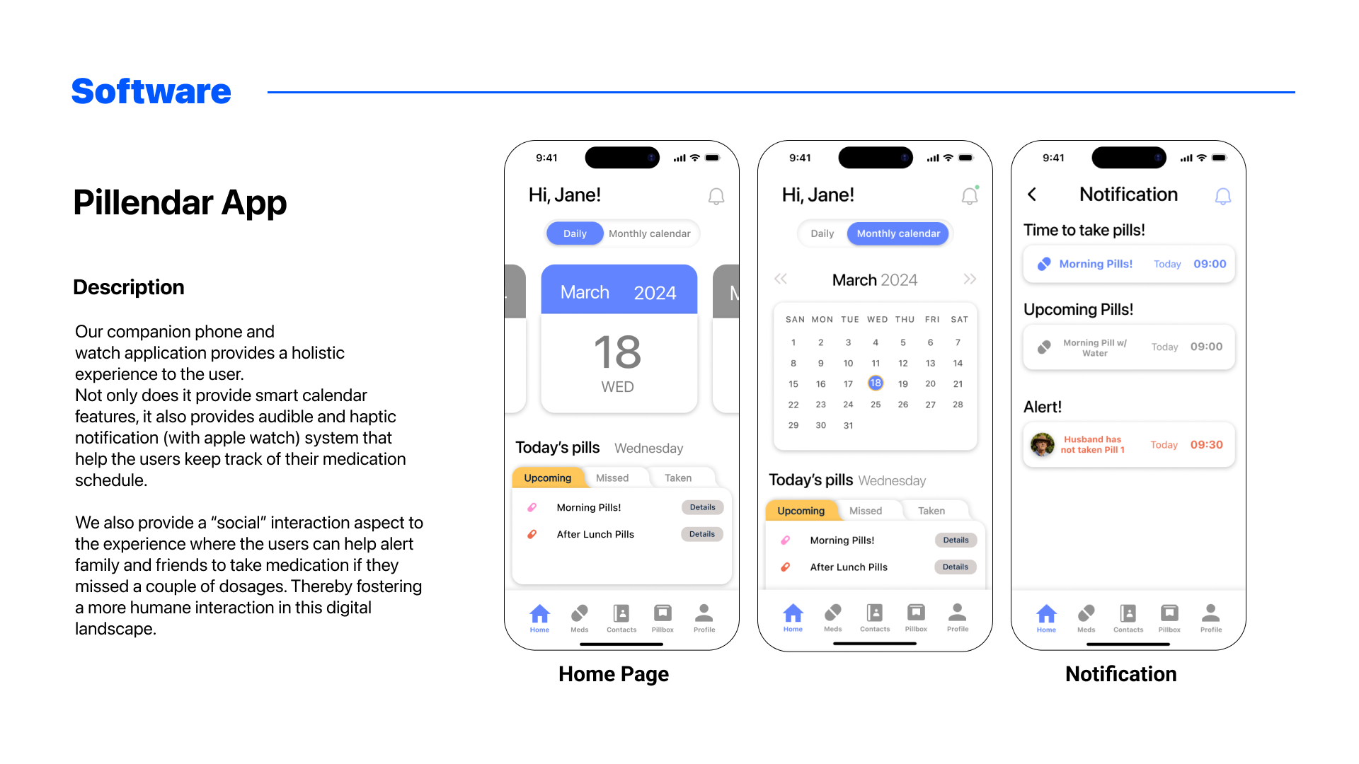
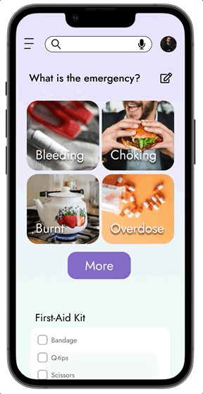
We aim to design a device and accompanying application that aids the users in keeping track of their medication progress. The device has the potential to provide flexibility catering to the user's unique lifestyle. The users will be able to use the application to view, edit, and communicate with their loved ones or professionals regarding their medication status. We hope that our proposed design will provide a holistic solution to tackle the medication non-adherence issue.


After delving into secondary research data and primary interview data, we can gather that the pain points for medication non-adherence includes:
1. Inconvenient Pill Management
2. Lack of Timely Reminders
3. Difficulty in Understanding Instructions
4. Limited Support Network
5. Difficulty in Adhering to the Schedule of Busy Lifestyles
6. Risk of Cross Reaction and Medication Errors
7. Communication Barriers ... etc
At first, we set the target users in the age group of 10-20 yo young adults and 30-50 yo working adults (shown first image below) as these user groups are well-versed with digital products.

After testing and deliberation, we aim to further push the design to cover the main target user of this product, elderlies (in 70 yo+) who needs simplified instructions to complete the user journeys. As we delve deeper into our design process, you will see how the product evolves to address all their pain points.


As we set the sitemaps and started drafting the screens for the application, we also started ideating and exploring the forms of the physical prototypes. In this stage, nothing was set in stone and we pivoted a lot due to tester feedbacks.
We aimed to use e-ink display to dynamically shift displays based on the time. We also want each day to be reconfigurable, meaning they can be detached from the base and re-attached to each other for the "Portable Mode".
E-ink is especially useful for this feature, as the only time it needs power is the refreshing phase. Thus, we could eliminate the need for individual batteries for each pillbox.

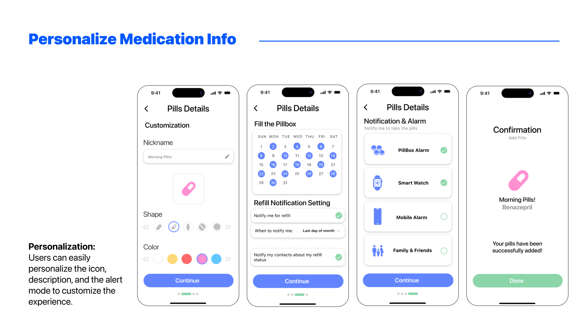
We mapped all of the features from the site map into our digital wireframes. We spent a lot of time tweaking the user flow so that everything makes sense.

We held numerous testing sessions to perfect the user flow of the application, the color combination choices of the app, and the placements of the UIs. For the physical product, we set the dimensions based on popular products on Amazon and tested with users to see if the sizing of each pillbox makes sense.


As we wishes to push this product to our core target audience, i.e., the elderlies, we delve deeper into their painpoints. For example, elderlies often suffer from Polypharmacy, in which they need to take multiple medication to treat one or more conditions.
By asking the users to take the medication out of the vials, one problem emerges, i.e., what if the pills are identical?
We redesigned the device and application to incorporate a Week Mode. With the magic of e-ink, users can easily change the display to show medication that needs to be taken in the morning and at night.
We hope this will help separate pills that needs to be taken at different times.

Considering not all users are tech-savvy by nature, we designed an affordable version with print-outs in lieu of the displays.
While users need to manually rearrange the pillbox, it enables we to stack the pillbox on top of one another to facilitate the week mode, as shown below.


For the application, we redesigned the homepage and the refilling page for the week mode. Users can toggle between week mode and month mode from the settings.

Some description on the dimension of the physical product and different CMF options.


In conclusion, this project to combat medication nonadherence proved to be an invaluable learning experience.
By designing a holistic physical and digital product experience, we not only impressed the competition judges with our ingenuity and marketability, but more importantly, we gained a deep understanding of the iterative design philosophy within interaction design.
While there is still much to be accomplished in this topic, this project has equipped us with the knowledge and skills to continue developing solutions that make a real difference.
I am very grateful to my team. Without everyone's hard work, we would never had succeeded. Go Team Pillendar!


